Work / Control Seven
Control Seven
A mobile device management platform for monitoring, controlling, and securing company devices.
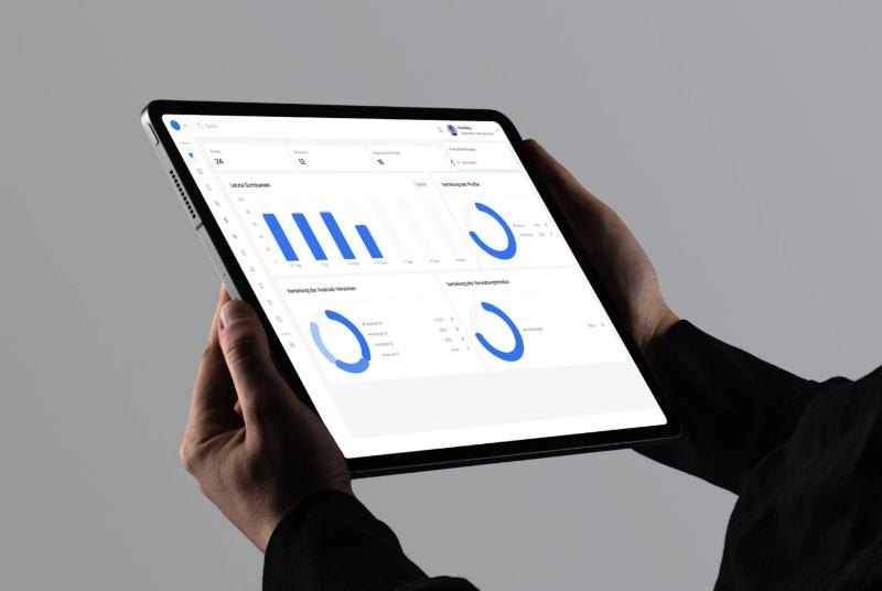
A mobile device management platform for monitoring, controlling, and securing company devices.
Device management that feels under control.
Control Seven helps organizations manage their company mobile devices. Administrators see device status, manage configurations, enforce security policies, and monitor usage from one place.
The goal was an interface that keeps the operational depth of a device management tool and stays clear enough to use every day.
Powerful tools that are hard to steer.
Device management holds dense data, security settings, and several administrative layers. It gets hard to navigate quickly.
Device monitoring, policy configuration, user management, and reporting had to work together without friction.
Real-time device information had to stay readable, with a clear hierarchy.
Locking a device, pushing an update, or changing a configuration has to feel intentional and safe, to reduce the risk of user error.
The system also had to stay open to new features and enterprise growth.
From administrative workflows to a design system.
I mapped the administrative workflows and identified the most frequent actions: monitoring device health, applying security policies, and managing user access.
The information architecture keeps high-level dashboards apart from detailed configuration views.
Wireframes group related controls and present device data in structured layouts, to reduce cognitive load.
A modular design system for dashboards, tables, status indicators, and control panels, with clear states for every device.
Overview first, detail on request.
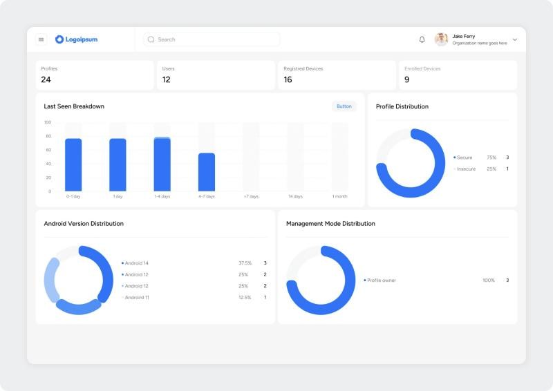
An administrator starts with the whole fleet and narrows down: from the dashboard to a list, from the list to one device, and from the device to an action. Each level shows only what that decision needs.
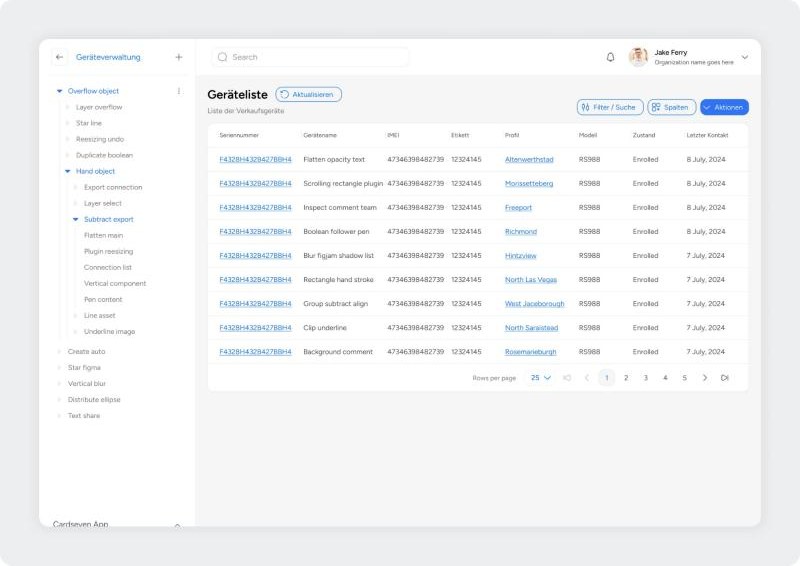
Status, model, and last contact for every enrolled device.
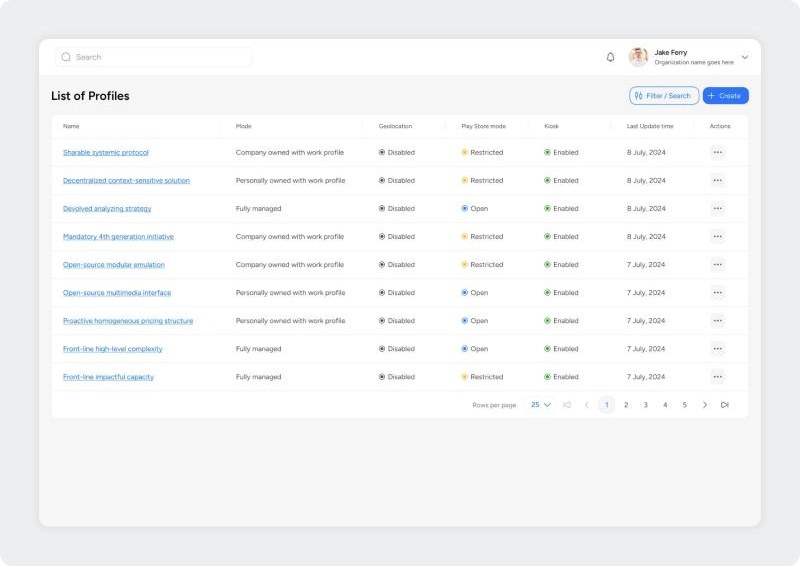
Security profiles with management mode, geolocation, Play Store, and kiosk settings.
Access for administrators and their organizations.
How versions, profiles, and device activity are distributed across the fleet.
Deep structure, one click at a time.
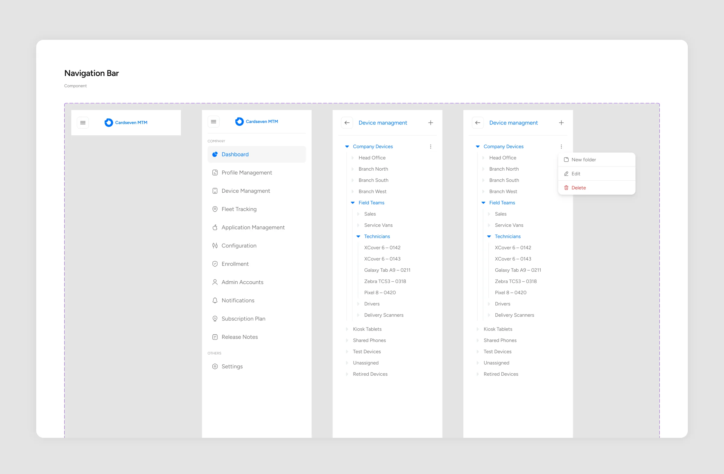
Companies organise their devices in nested groups: offices, teams, and the devices inside them. The sidebar turns into a tree for this. It goes from the collapsed bar to the main menu, then into device management, where groups open level by level and every group has its own menu for new folders, editing, and deleting.
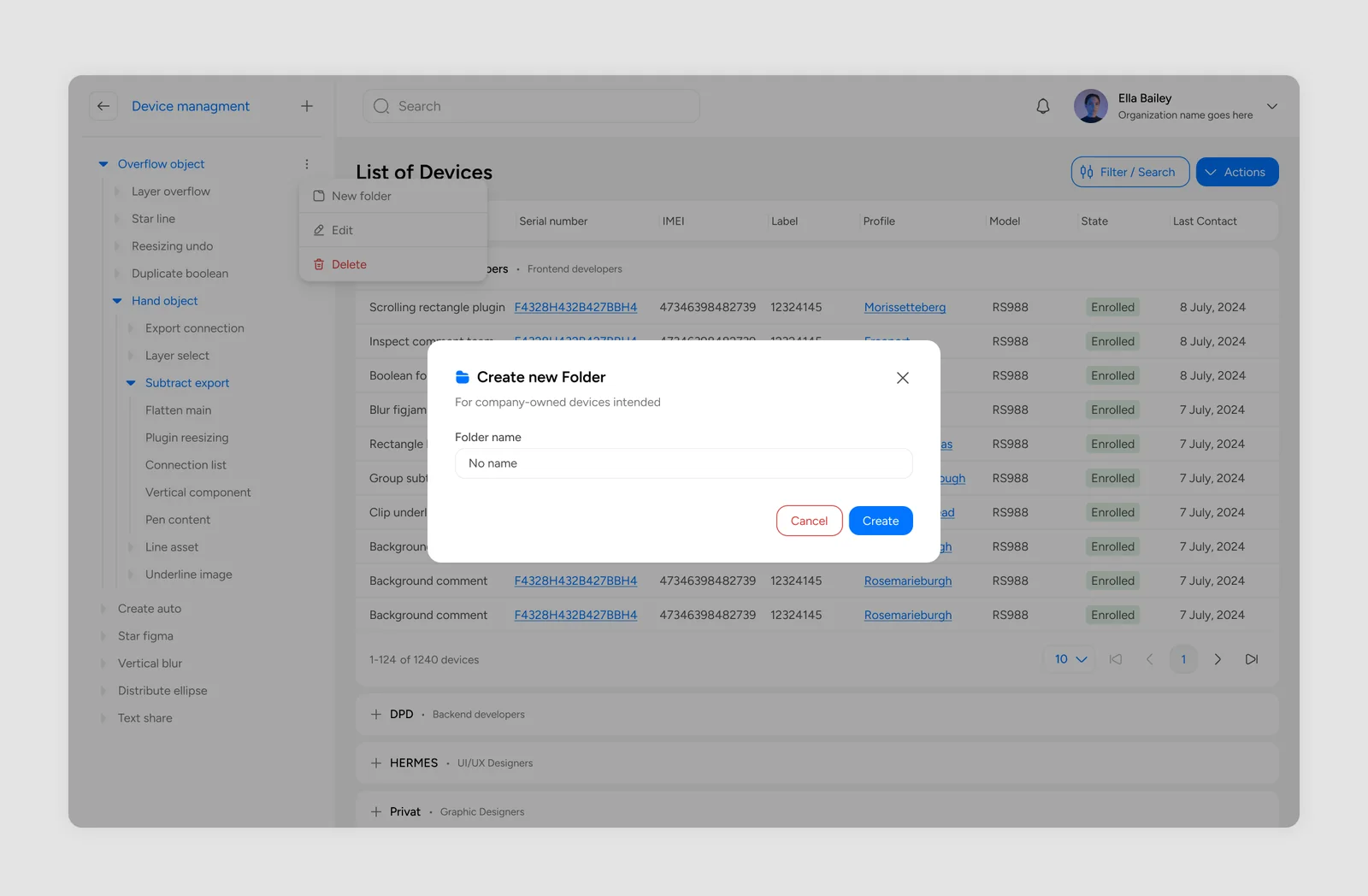
Creating a group happens in place, in a short modal over the device list, so the administrator never loses track of where the new folder will sit.
One blue, and status you can read at a glance.
White surfaces on a light grey canvas, one strong blue for actions and data, and a small status marker on every row: enrolled, restricted, enabled, disabled. Tables and charts share the same spacing and type, so a new screen looks familiar right away.
List of Devices
Company Devices · Field Teams · Technicians
A clean geometric sans that stays readable in dense tables, small labels, and long device lists.
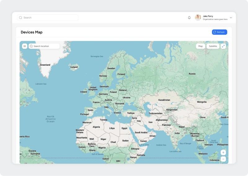
The device list is built for scanning: serial number, name, IMEI, profile, model, state, and last contact in one row, with a group tree on the left. The map shows where the fleet is.
Key features
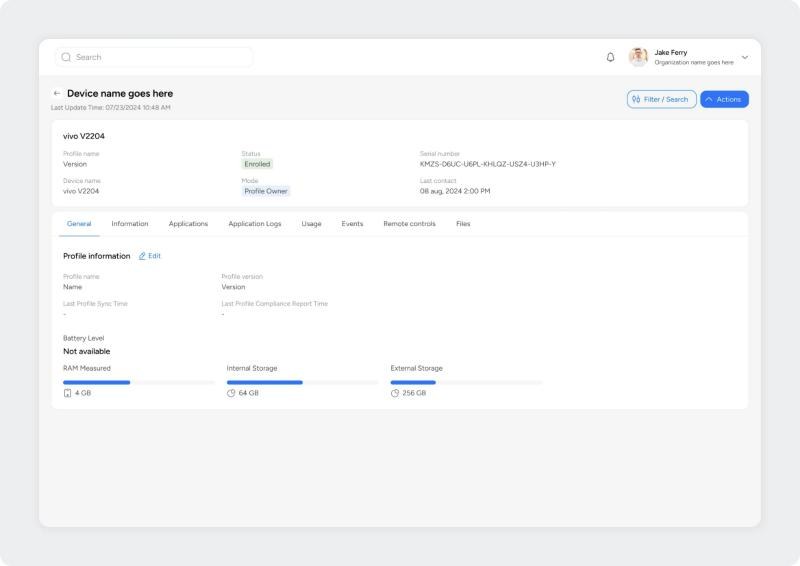
A device page starts with identity and status, then splits the rest into tabs: information, applications, logs, usage, events, remote controls, and files. Memory and storage are shown as bars.
Key features
Security profiles are listed with their mode and the settings that matter most: geolocation, Play Store mode, and kiosk. Each setting is a labelled state, so the difference between two profiles shows up while scanning a column.
Key features
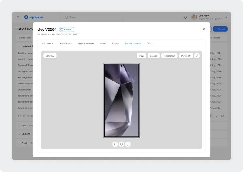
An administrator can open a live view of a device, start a session, send a notification, or power it off. The controls sit in a modal on top of the list, so it is always clear which device is being touched.
Key features
Actions that ask before they act.
Locking a device, pushing an update, or changing a configuration affects someone's working phone. Security-related actions ask for confirmation and say exactly what will happen, so administrators stay confident when they make system-level changes.
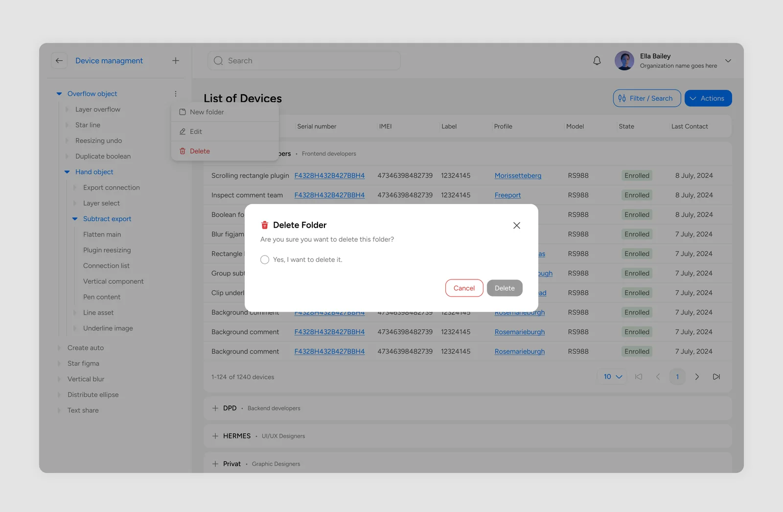
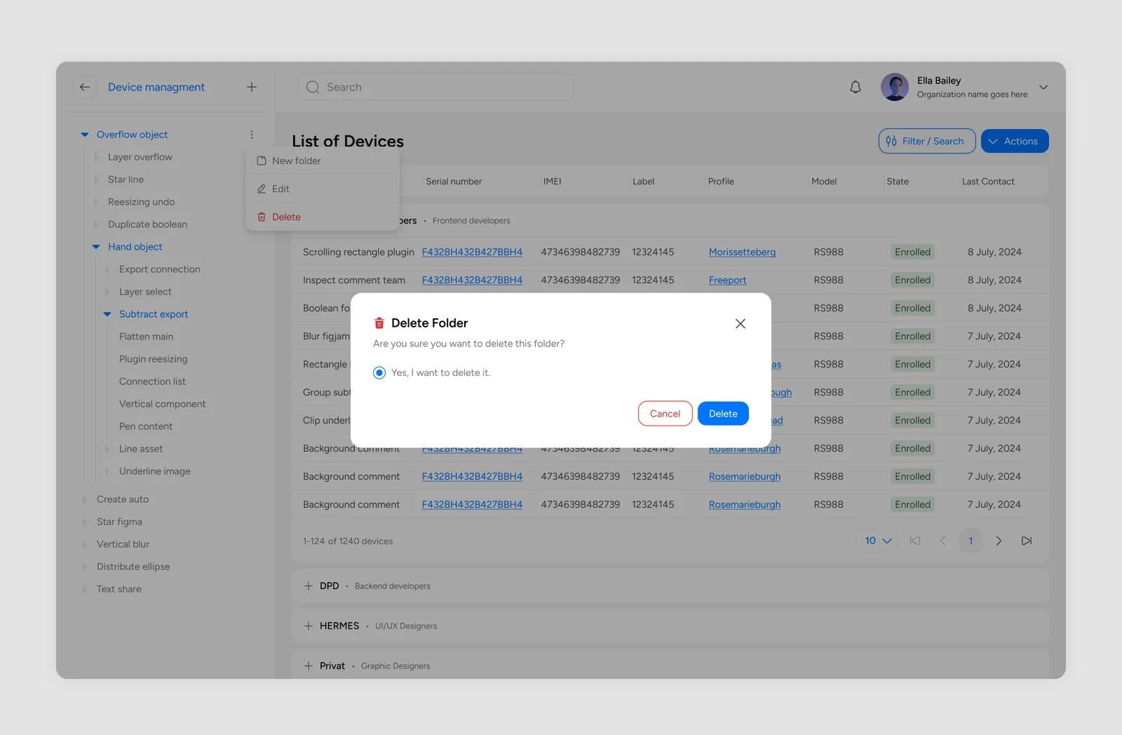
Deleting a folder is the clearest example: the Delete button stays grey until the administrator confirms, and only then turns blue.
Complex administration, made clear.
The result is a structured management platform where complex administrative work is clear and efficient to carry out.
The design system gives the product a base for enterprise growth and new modules.