Work / Islamic App
Islamic App
A mobile app that brings prayer times, Qibla direction, and Quran reading into one calm daily companion.
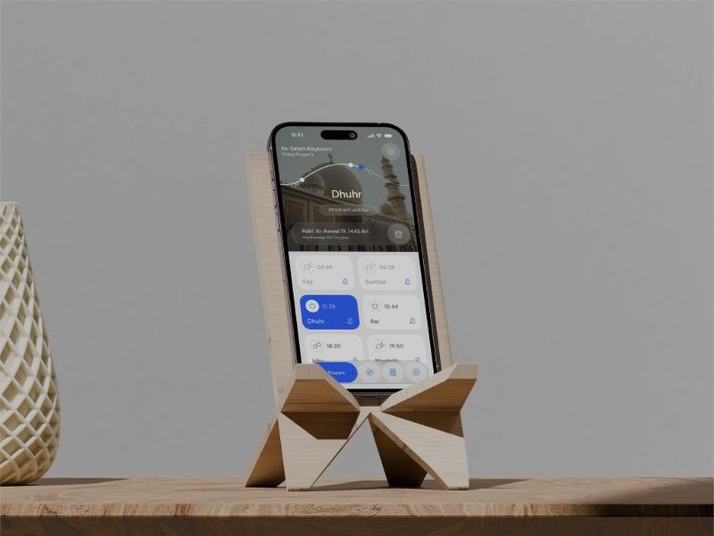
A mobile app that brings prayer times, Qibla direction, and Quran reading into one calm daily companion.
Three daily tools in one calm app.
A complete product design for a mobile Islamic app. It combines accurate prayer times with customizable Adhan notifications, a precise Qibla finder, and a Quran reading experience with progress tracking.
Beyond function, the app had to feel calm and respectful, in keeping with the place it has in someone's day.
Useful features, crowded together.
Prayer times, Qibla direction, Quran reading, and notification settings had to fit without overwhelming. Many similar apps feel crowded or visually inconsistent.
The interface needed to feel modern, calm, and trustworthy without becoming decorative or distracting.
In the Quran module, Arabic text and translations need a clear hierarchy and strong readability.
Prayer times and Qibla direction depend on precision, so the interface has to communicate confidence.
Dark mode also had to be comfortable for night reading without losing legibility.
What people told us.
Before designing, we interviewed people about the apps they already used. Two complaints came up again and again: intrusive ads that interrupted access to the very features people opened the app for, like prayer times and the Qibla finder, and a visual design that felt cluttered and busy.
That set the goal: a minimal, user-friendly app with a seamless experience, and features that align with Islamic principles and values.
Interruptions at the moment someone needs a prayer time or the Qibla direction.
Busy layouts that make simple daily tasks feel heavy.
The app had to work for a wide range of users, including people with disabilities, with support for screen readers and high-contrast modes.
Start from three journeys.
User flows and journey maps from onboarding to daily use, with the touchpoints and emotions along the way.
Low-fidelity wireframes for layout and structure, then high-fidelity wireframes for the visual design and functionality.
Visual design guidelines for colour, typography, and iconography, and UI elements such as buttons and icons that keep the style consistent.
Interactive prototypes to test the key features, and a navigation that puts the essential features first.
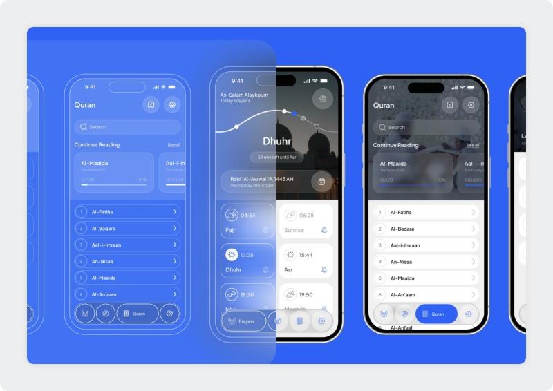
Four tabs, and every tool one tap away.
The bottom navigation holds the whole app: prayers, Qibla, Quran, and settings. Each tab opens on the thing people come for, and anything deeper is one step in.
One blue, soft surfaces, and type for two scripts.
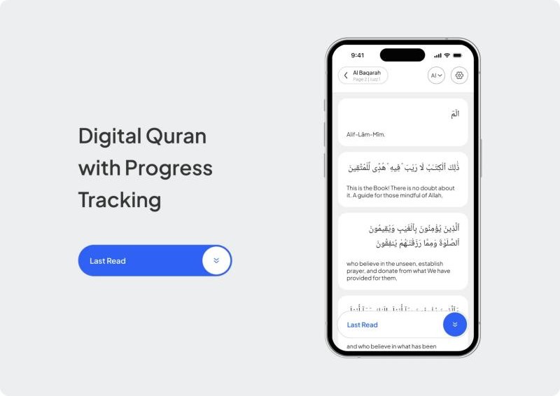
A single blue marks the current prayer, the active tab, and every primary action. Cards are white on a soft grey in light mode and near-black in dark mode. Arabic text is set larger than its translation, so the eye lands on it first.
Fajr · Dhuhr · Asr · Maghrib · Isha
Next prayer in 1 hour 24 minutes
A soft geometric sans with open forms, calm next to Arabic text and clear at small sizes.
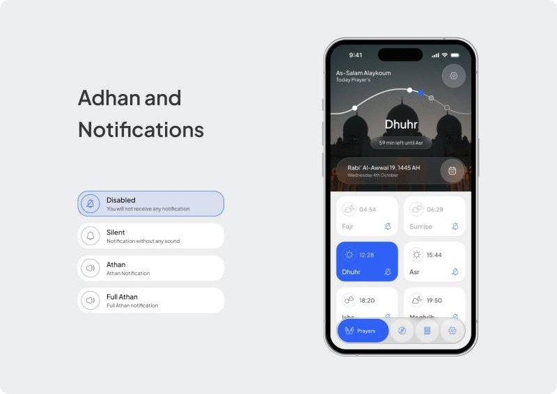
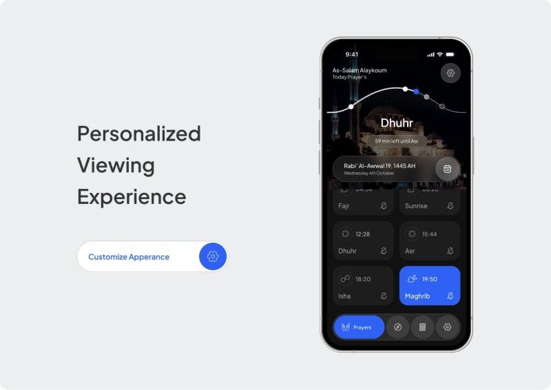
The home screen draws the day's prayers on an arc, with the next one highlighted and the time remaining. Every prayer has its own notification setting.
Key features
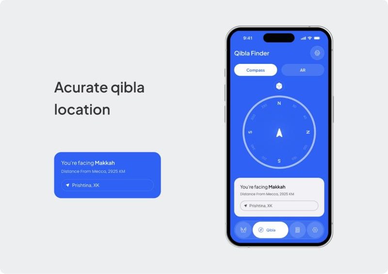
The Qibla finder is a clean compass with one sentence under it: you are facing Makkah, and how far away it is. An AR view is one tab away.
Key features
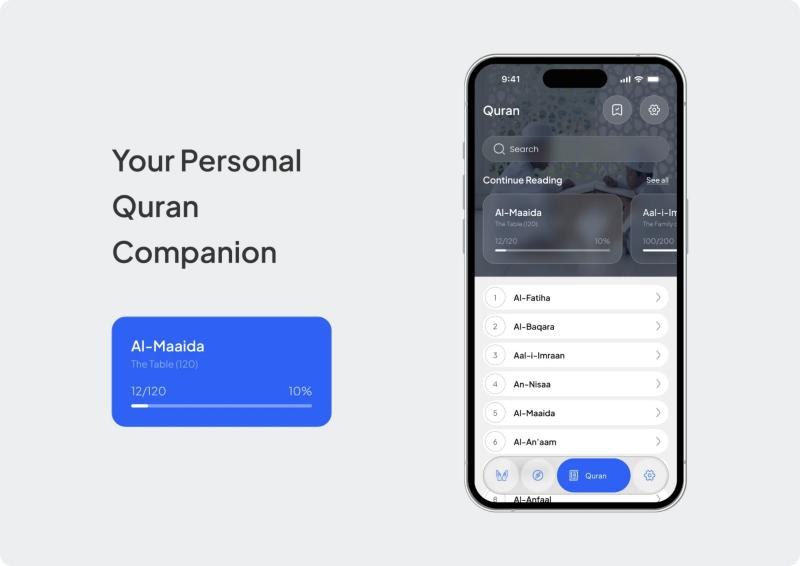
The Quran tab opens with continue reading and a progress bar, above the list of surahs. In the reader, Arabic and translation alternate in cards, and a Last Read button returns to the saved place.
Key features
Comfortable at night, legible at noon.
Dark mode is a full second design. Cards turn near-black, the blue stays the only accent, and contrast is tuned for reading late in the evening.
A daily companion that stays out of the way.
The final design delivers its essential tools in a structured, accessible format with a calm visual identity.
The design system can support later additions such as community functions, educational content, or deeper personalization.