Work / MARKU Steuerberatung
MARKU Steuerberatung
A website redesign for a tax advisory firm in Vienna, making complex financial services feel clear, credible, and easy to act on.
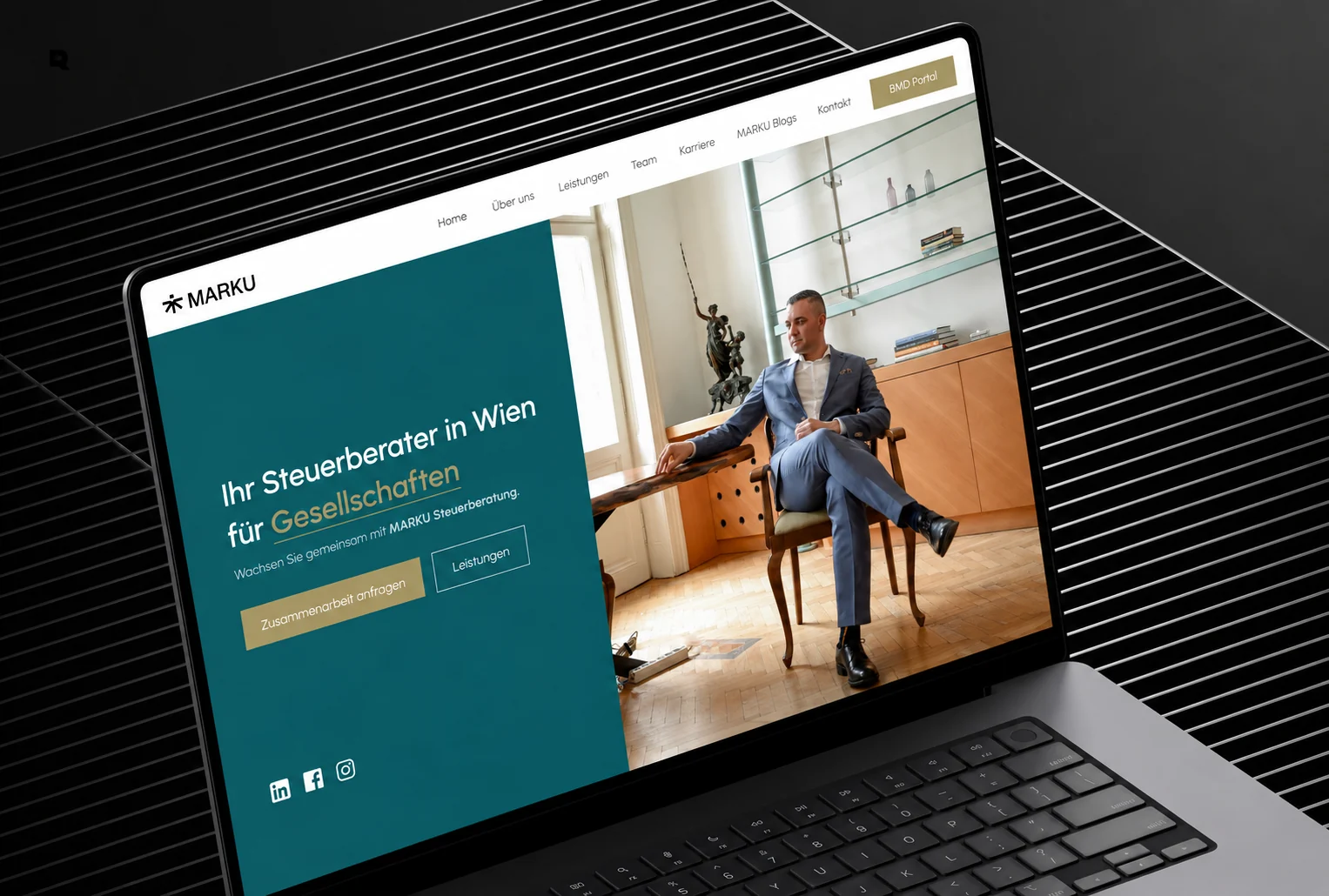
A website redesign for a tax advisory firm in Vienna, making complex financial services feel clear, credible, and easy to act on.
Expertise, without the technical overload.
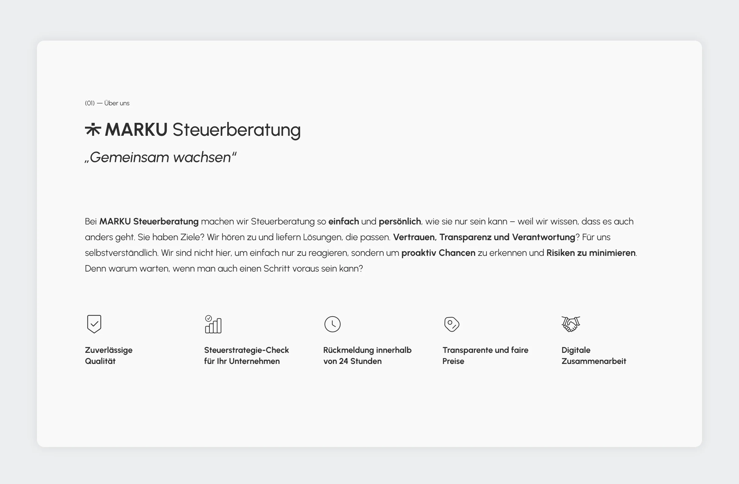
MARKU Steuerberatung advises companies, freelancers, and private clients in Vienna on tax, accounting, and payroll. The firm wanted its website to show professionalism and reliability, and to make complex services easy to understand.
I redesigned the site from the structure up: information architecture, wireframes, and the final interface. The aim was to show expertise through order and hierarchy, not decoration.
Dense content, and no clear way in.
Many service categories, legal terms, and long explanations had to become easy to scan.
People choose a tax advisor on trust. Clutter and decoration work against it.
Businesses and private individuals each needed to find their own services quickly.
On the old site it was hard to tell how to request a consultation.
Structure first, then a quiet visual language.
I separated the service categories and mapped a journey for each target group.
Typographic hierarchy and short content blocks were settled before any visual design.
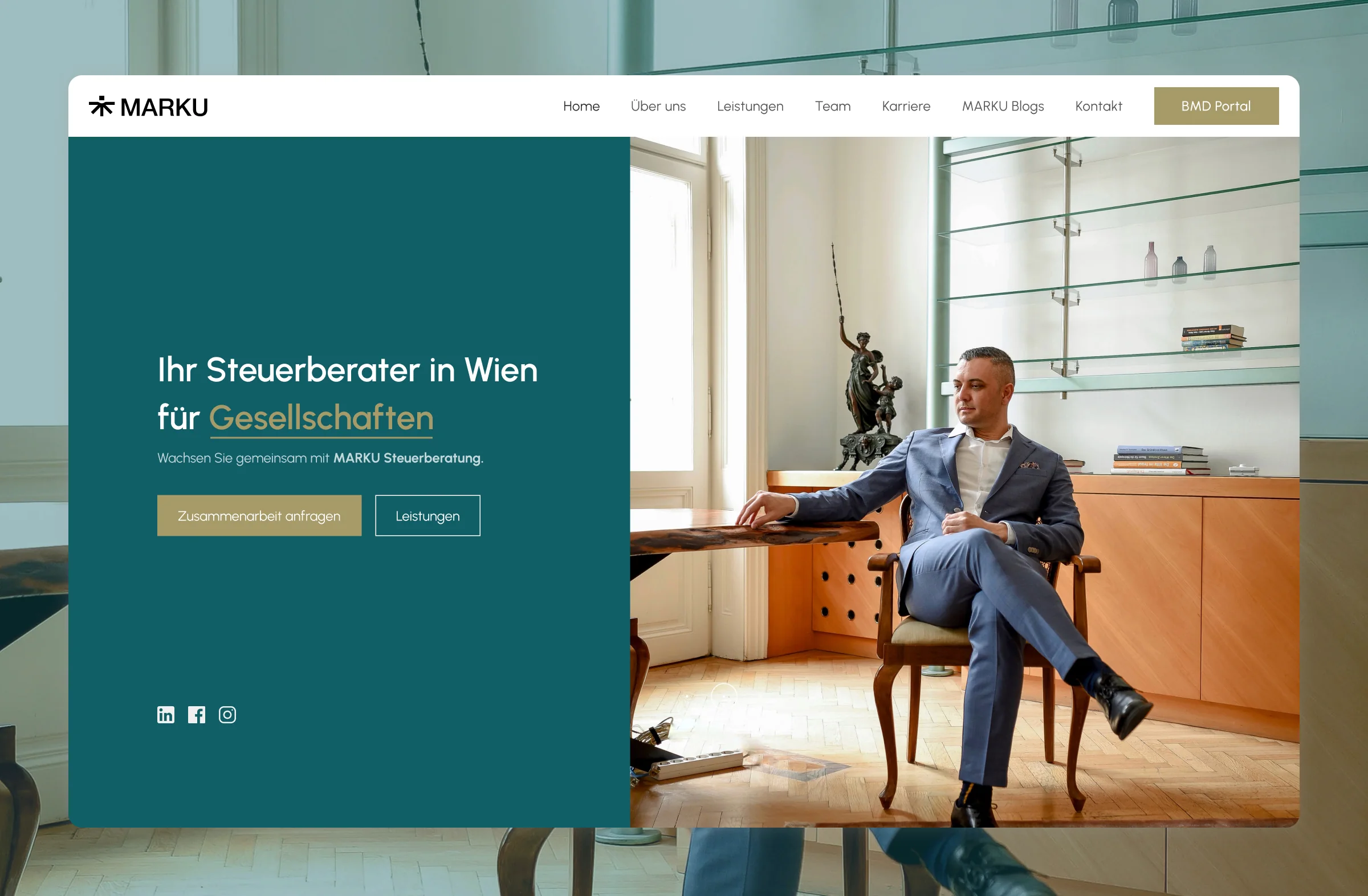
Deep teal, a muted gold, generous spacing, and calm typography: authoritative, still approachable.
Every section leads to an action, and the contact flow asks for as little as possible.
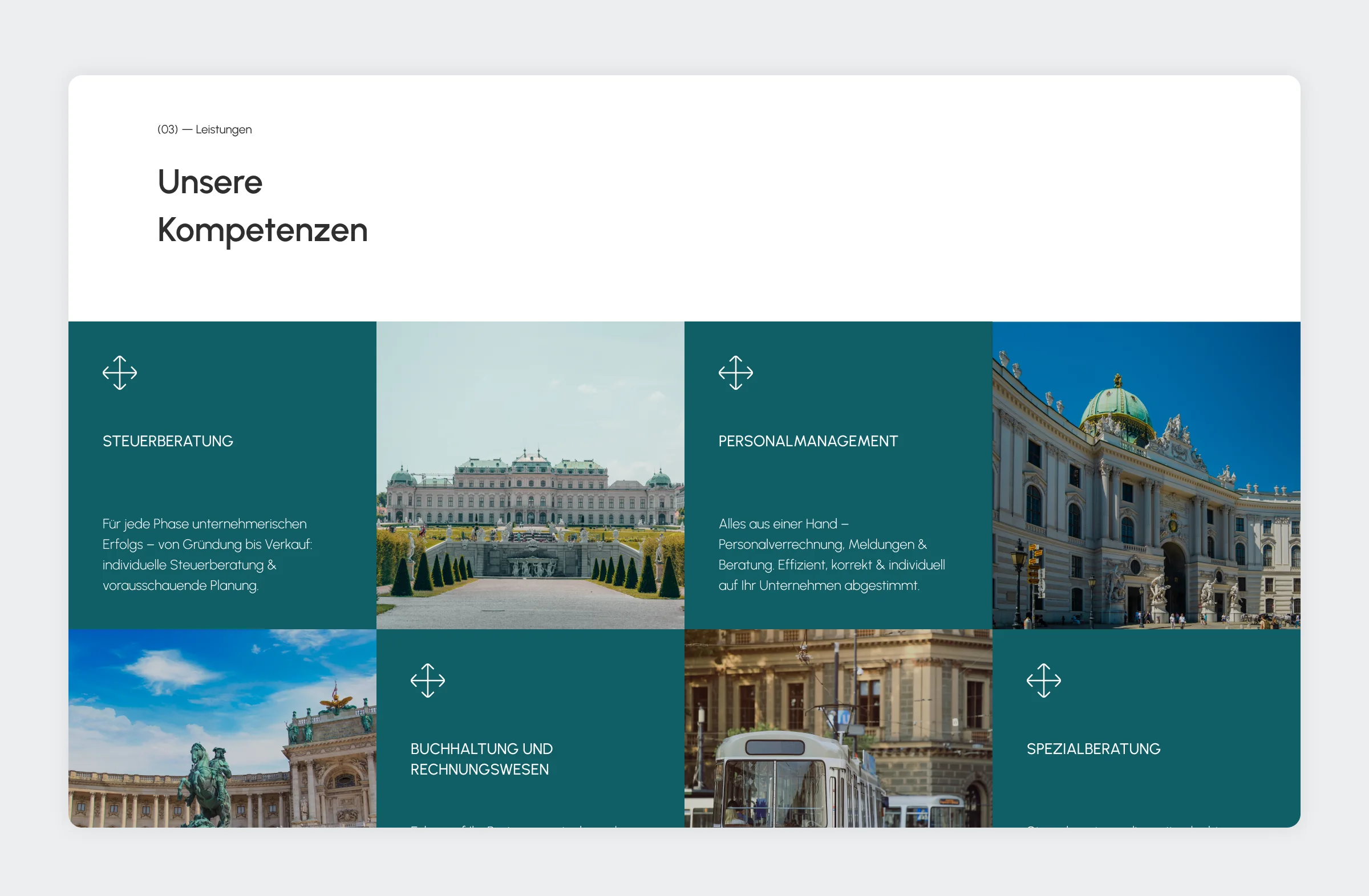
Vienna, in teal and gold.
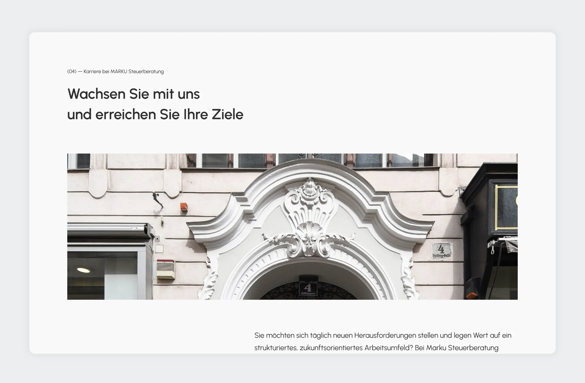
The service grid alternates the four competences with photographs of Vienna, so the firm feels local before a word is read.
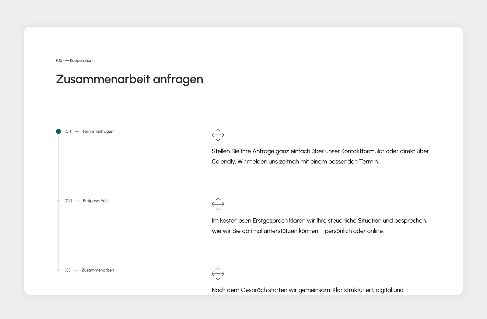
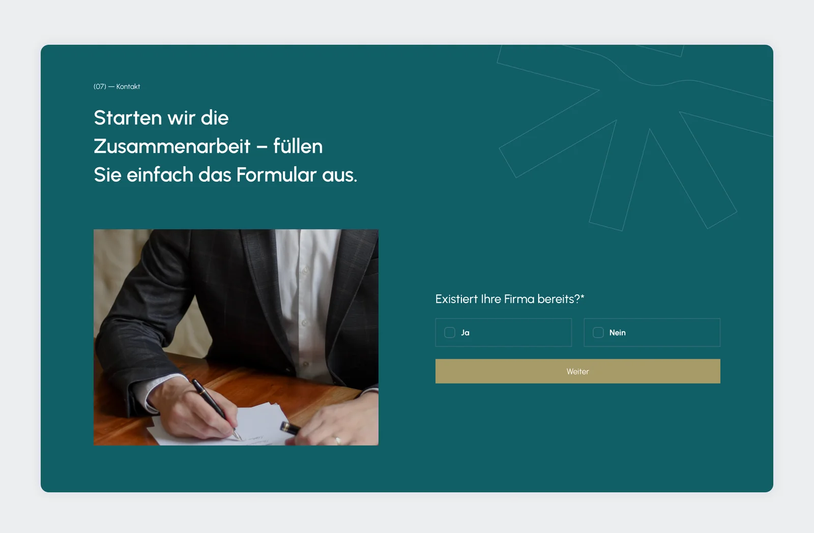
Working together is spelled out in three steps: request an appointment, a free first conversation, then the collaboration. The contact form asks one question at a time, starting with whether the company already exists.
Clear, credible, and easy to act on.
The redesign gives the firm a structured, professional presence. Visitors see what MARKU does, find the services meant for them, and always know how to book a consultation. The structure leaves room for new services and content.
The site is live at marku-steuerberatung.wien.