Work / E.G.E.S
E.G.E.S
A website redesign for a solar and renewable energy company, with a configurator that estimates a system from the visitor's own roof.
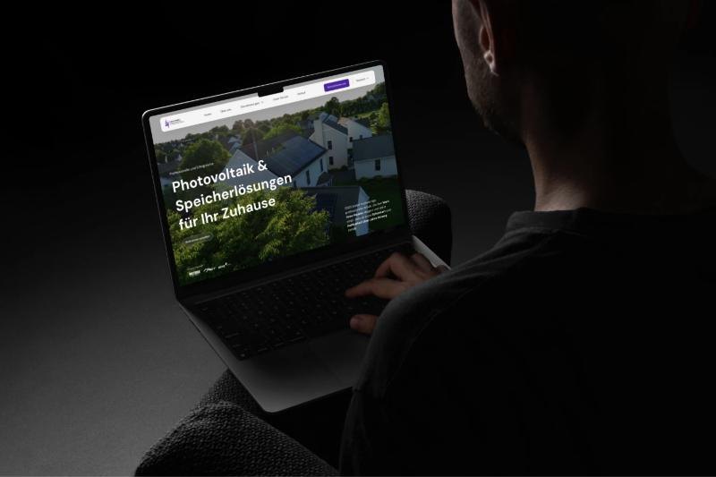
A website redesign for a solar and renewable energy company, with a configurator that estimates a system from the visitor's own roof.
Technical services, explained so a homeowner can act.
EGES installs solar systems and renewable energy solutions for private and commercial customers. This project was a complete redesign of their website.
The goal went past a new look: a clearer structure, services that are easy to tell apart, and a path from first read to inquiry. The centerpiece is an interactive solar configurator.

Real expertise, presented in a way few could follow.
The previous site gave every piece of content the same weight. Visitors struggled to understand the services, the installation process, and the benefits.
Technically informed buyers want system specifications. Homeowners want a plain explanation and some reassurance. Both read the same pages.
Engineering terminology, installation steps, and regulatory information had to become digestible without being oversimplified.
Nothing on the site was interactive, and no path led naturally toward a consultation.
Structure first, then the interface.
Logical navigation, a clear breakdown of services, and a stronger content hierarchy.
User flows so a visitor can understand the company's expertise, explore solutions, and take action.
A modular structure that splits technical information into short sections, with clear typography and rhythm.
Clean layouts and structured spacing that suit an engineering brand, with calls to action placed throughout.
From a roof to an estimate in a few clicks.
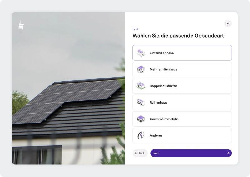
The configurator answers the question every visitor arrives with: what would this look like on my building? They pick a building type, describe the roof, and get an estimated system size and potential output. A personal number arrives early, which shortens the decision and gives the inquiry a reason.
One purple, a lot of white, and room for the photography.
The brand's purple carries every action and highlight. Everything else stays white and light grey, so photographs of real installations do the persuading. Line icons and thin line graphics echo the engineering side of the company.
Photovoltaik & Speicherlösungen für Ihr Zuhause
Solar energy for private and commercial customers
A geometric sans with open shapes and good legibility at small sizes, so technical copy stays easy to read.
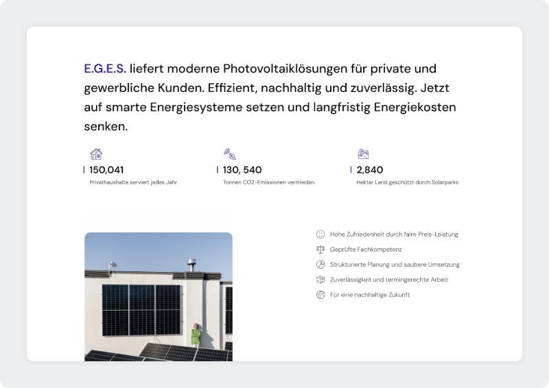
The home page says what EGES does in one sentence, backs it with three figures that show its scale, and lists the reasons customers choose it.
Key features
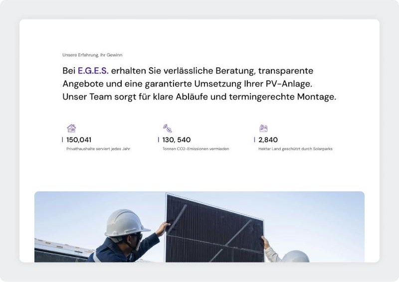
Many people assume solar is expensive and complicated. This section answers with figures: price advantage and self-sufficiency shown as simple rings, under a direct prompt to get in touch.
Key features
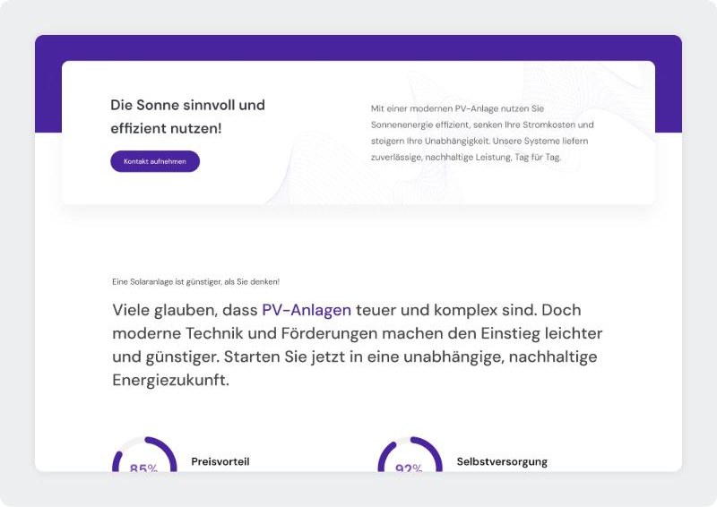
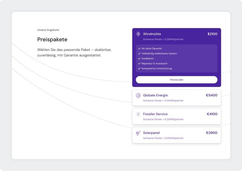
Four packages sit in one compact list. The selected one opens to show what is included. The others stay as a single line with name and price.
Key features
Every page ends in a next step.
Conversion points sit throughout the site, each with a clear call to action, and the contact process behind them was simplified. A visitor who has just seen an estimate or a package is one click from a consultation.
A technical company that is easy to understand.
The site now explains EGES's services in plain terms and gives every page a next step.
The configurator turns a passive read into a concrete estimate, and the modular structure leaves room for the site to grow.