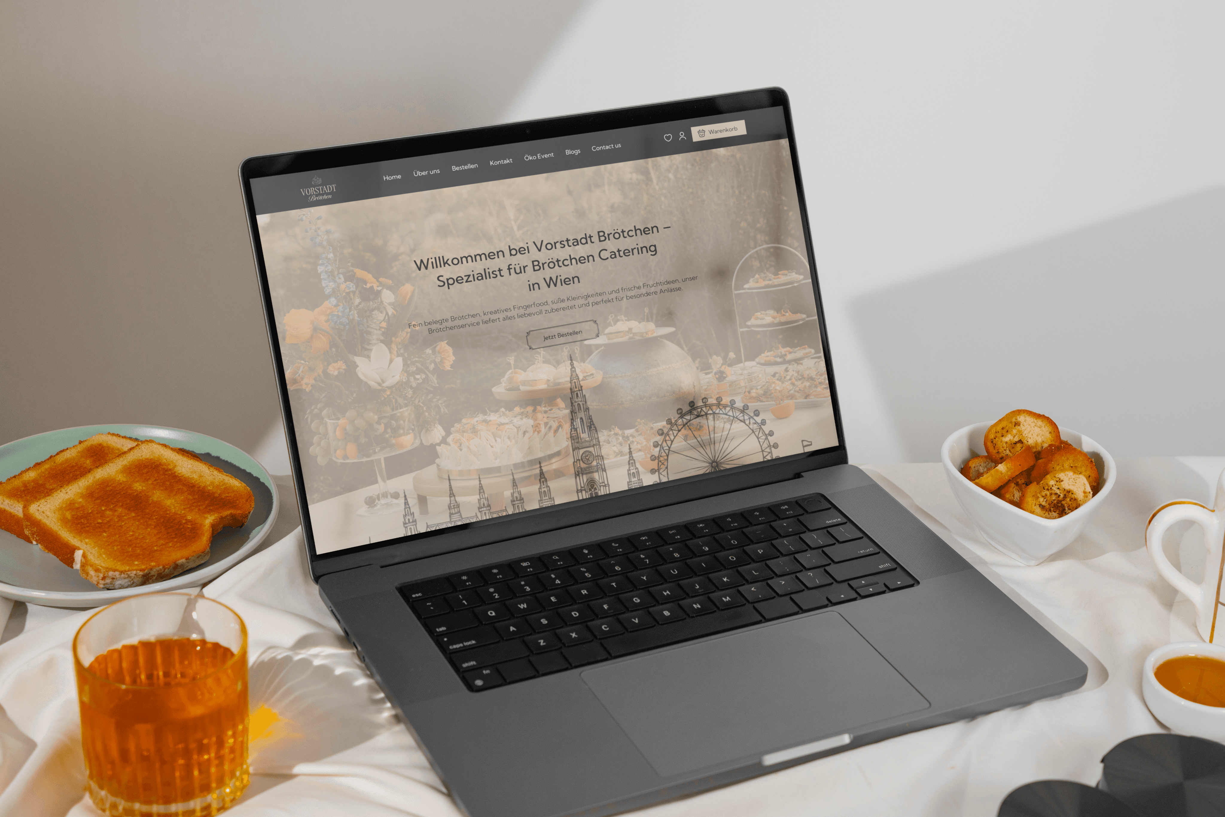
Brötchenshop
A classic Viennese inspired catering website that blends traditional aesthetics, hand drawn illustrations, and modern e commerce structure into a refined digital experience.
Brötchenshop
A classic Viennese inspired catering website that blends traditional aesthetics, hand drawn illustrations, and modern e commerce structure into a refined digital experience.
About
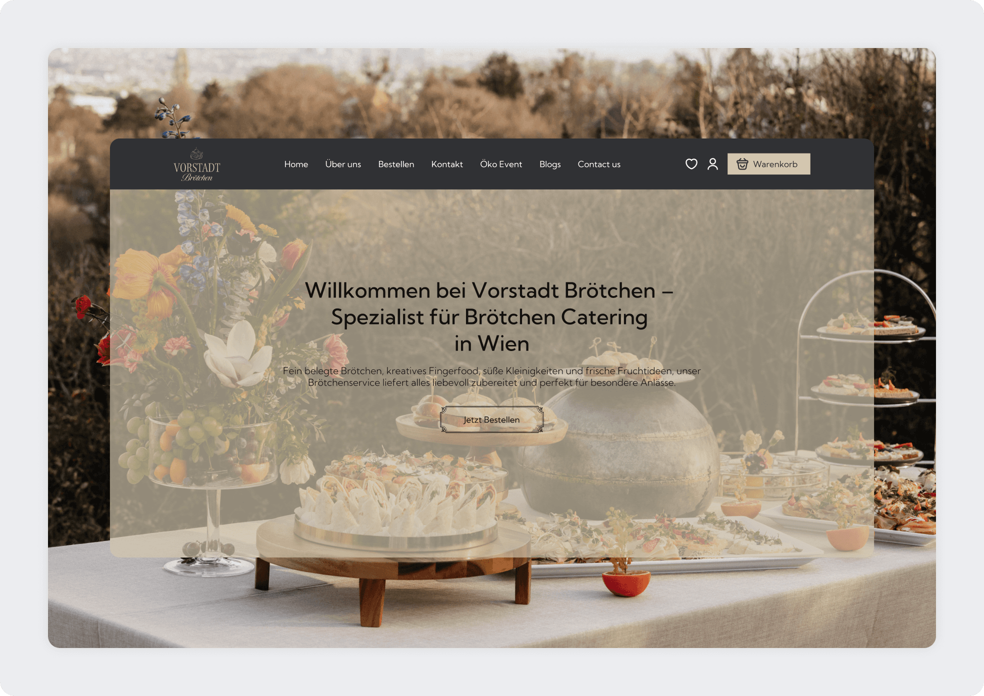
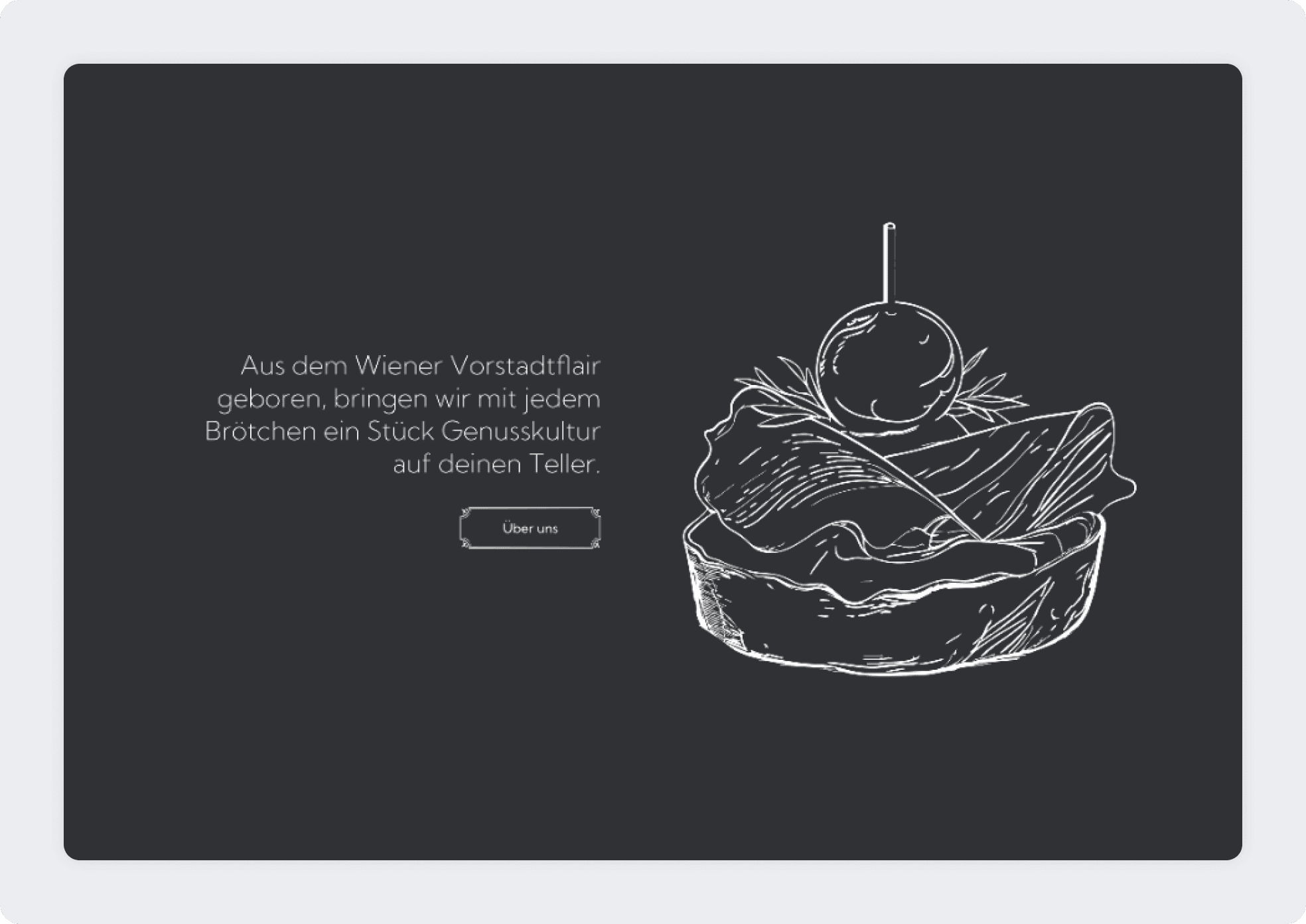
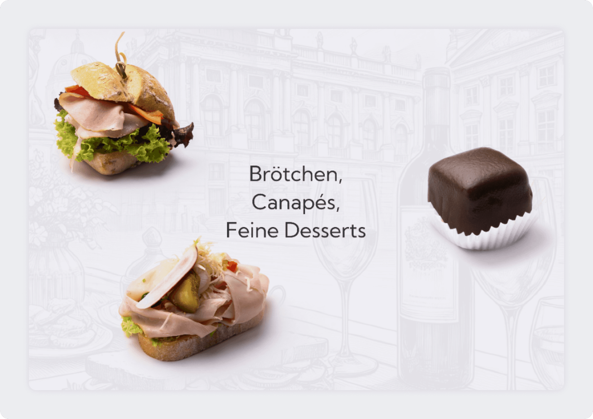
Vorstadt Brötchen is a catering brand specializing in handcrafted Brötchen, canapés, and fine desserts in Vienna. The objective of the project was to create a digital experience that reflects the elegance and cultural heritage of Vienna while supporting structured online ordering. The client specifically requested a classic visual direction inspired by Viennese history, incorporating traditional typography, subtle illustrations, and refined color tones. The design combines warm beige tones, deep charcoal backgrounds, and hand drawn graphic elements to evoke a timeless and sophisticated atmosphere. At the same time, the platform needed to function as a modern e commerce system, allowing users to browse products, view detailed descriptions, and place catering orders efficiently. The result is a balanced blend of heritage aesthetics and contemporary usability.
Industry
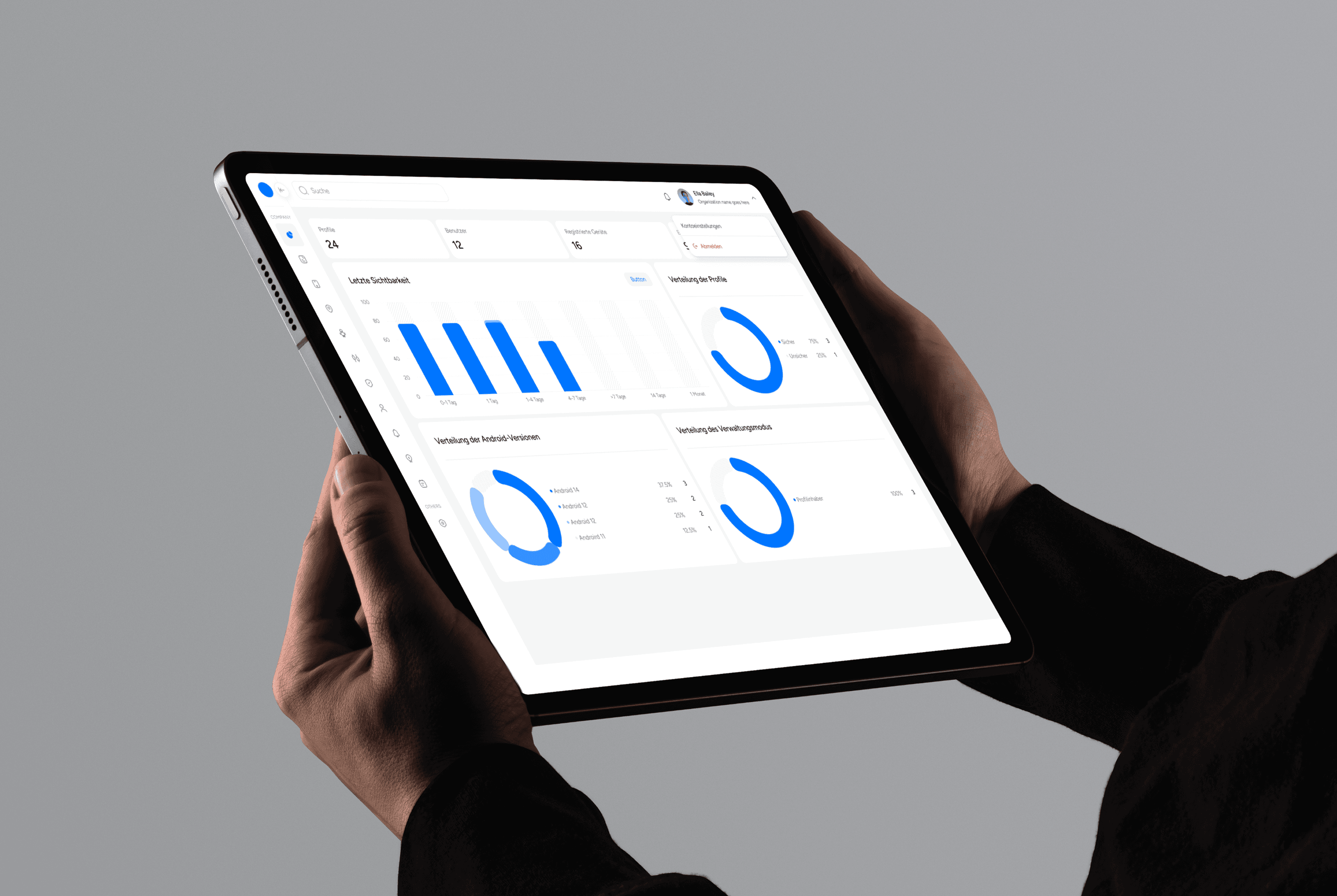
Renewable Energy
Renewable Energy
Renewable Energy
Renewable Energy
Renewable Energy
Type of work
Website Redesign
Website Redesign
Website Redesign
Website Redesign
Website Redesign
Timeline
5 Weeks
5 Weeks
5 Weeks
5 Weeks
5 Weeks
Challenges
The primary challenge was translating a traditional Viennese catering identity into a digital format without losing authenticity. The client wanted the website to reflect Vienna’s historical charm, which required careful integration of classic typography, subtle ornamental details, and illustrative elements without making the interface feel outdated. Another challenge was balancing aesthetics with functionality. Catering websites often require structured product grids, quantity selection, and ordering logic, which can feel purely transactional. The design needed to maintain warmth and elegance while supporting a clear and intuitive purchasing process. High quality food imagery played a central role in the experience. The presentation of Brötchen and desserts needed to feel premium and appetizing without overwhelming the interface. Product cards had to display images, names, and pricing clearly while maintaining visual harmony. Additionally, the homepage had to communicate brand story, craftsmanship, and local heritage before transitioning into the ordering experience. This required a structured narrative flow from brand introduction to product exploration.
The process
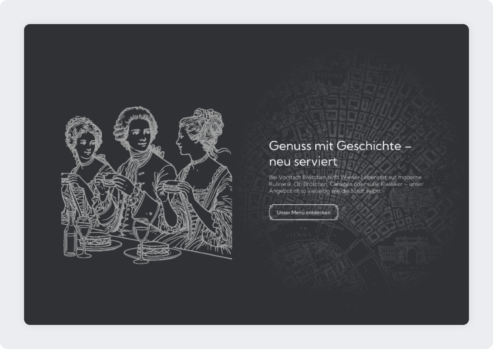
The process began with defining the visual direction based on the client’s request for a classic Viennese style. Inspiration was drawn from historical engravings, traditional signage, and cultural motifs associated with Vienna. A muted and elegant color palette was developed using warm beige and dark charcoal tones to create contrast and sophistication. Hand drawn illustrations and line art elements were integrated throughout the design to reinforce the historical identity without overpowering the layout. The homepage was structured to introduce the brand story first, supported by atmospheric imagery and subtle historic references, before guiding users toward the product catalog. The product grid was designed with strong spacing, consistent card structure, and clear pricing visibility to ensure usability. The product detail page was structured to provide high quality imagery, clear descriptions, and simple quantity controls. The checkout flow was simplified to reduce friction and maintain clarity. Responsive behavior was carefully considered to ensure the catering experience remains refined and functional across devices.
The process
The process began with defining the visual direction based on the client’s request for a classic Viennese style. Inspiration was drawn from historical engravings, traditional signage, and cultural motifs associated with Vienna. A muted and elegant color palette was developed using warm beige and dark charcoal tones to create contrast and sophistication. Hand drawn illustrations and line art elements were integrated throughout the design to reinforce the historical identity without overpowering the layout. The homepage was structured to introduce the brand story first, supported by atmospheric imagery and subtle historic references, before guiding users toward the product catalog. The product grid was designed with strong spacing, consistent card structure, and clear pricing visibility to ensure usability. The product detail page was structured to provide high quality imagery, clear descriptions, and simple quantity controls. The checkout flow was simplified to reduce friction and maintain clarity. Responsive behavior was carefully considered to ensure the catering experience remains refined and functional across devices.
The outcome
The final result is a refined catering website that successfully blends Vienna’s historical elegance with modern digital functionality. The platform strengthens the brand identity through classic typography, subtle illustrations, and carefully curated visual elements while maintaining a structured and conversion focused ordering system. Vorstadt Brötchen now benefits from a digital presence that reflects its craftsmanship and heritage, supports online catering orders, and enhances brand perception within a competitive local market.