Marku
A structured and modern digital presence designed to strengthen credibility, simplify financial services, and build trust through clarity and professional positioning.
Marku
A structured and modern digital presence designed to strengthen credibility, simplify financial services, and build trust through clarity and professional positioning.
About
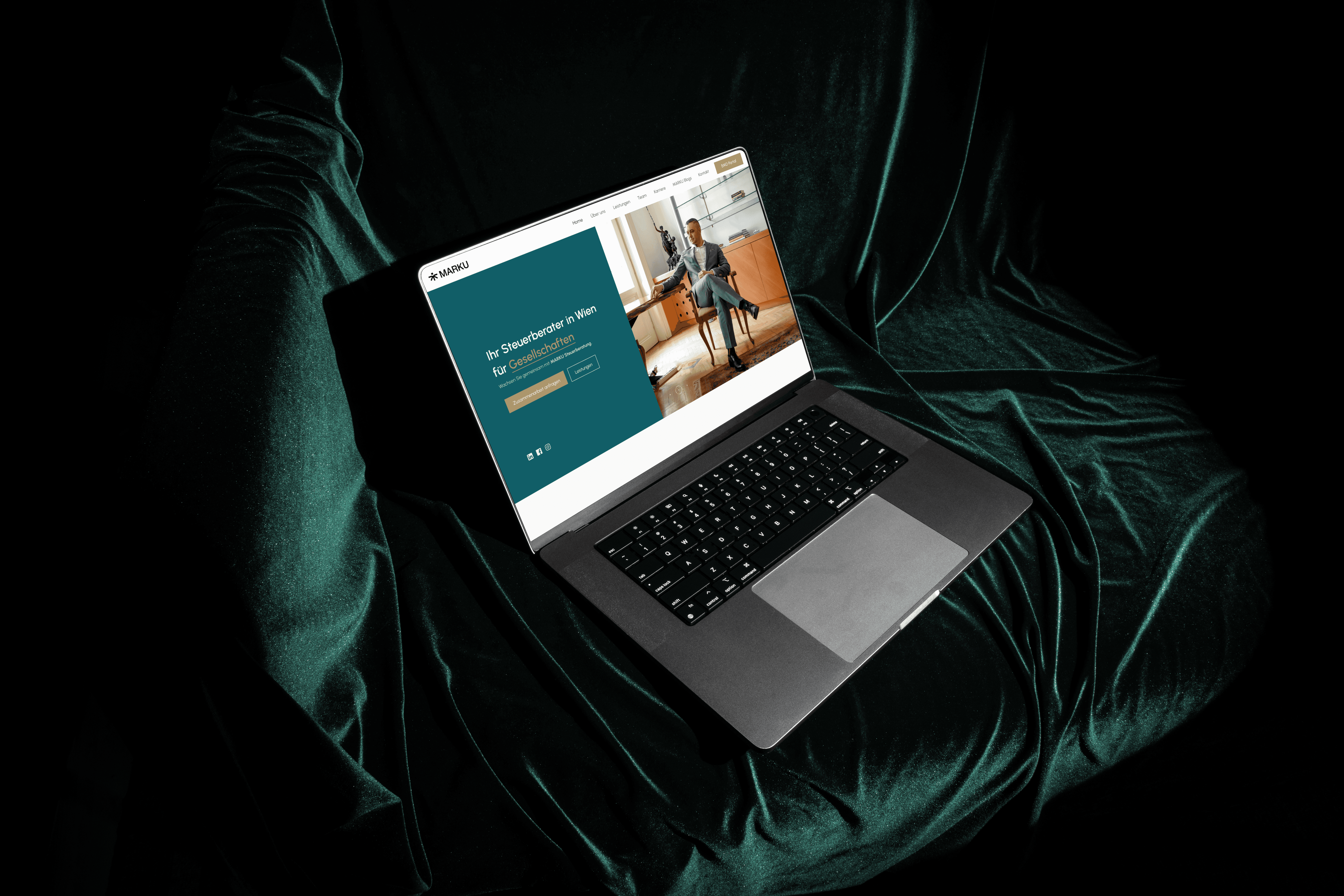
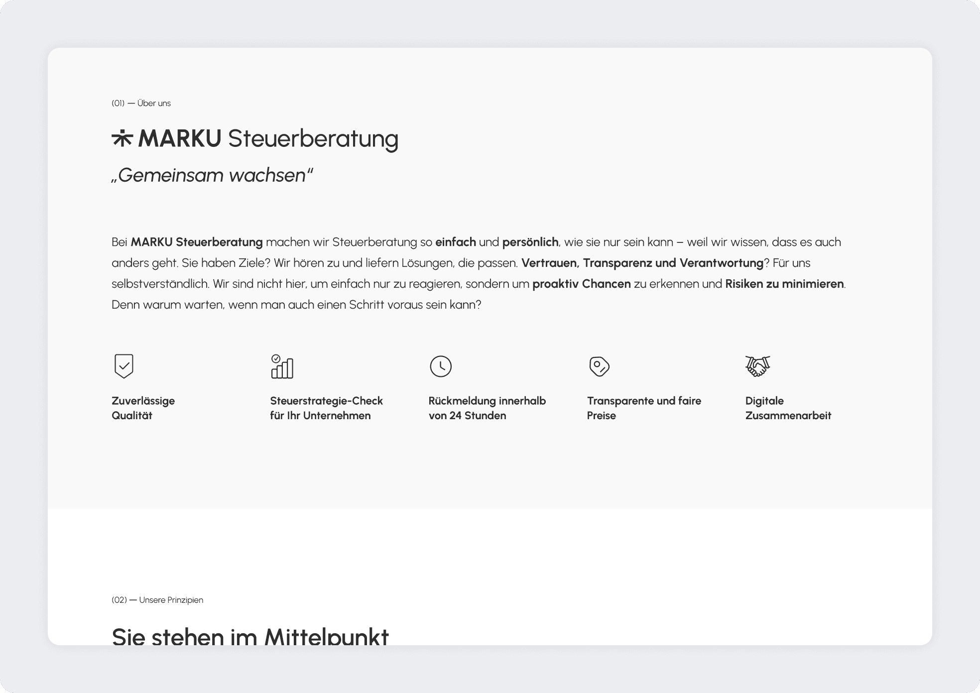
Marku Steuerberatung is a tax advisory and financial consulting firm serving businesses and private clients. The objective of this project was to redesign the digital presence to reflect professionalism, reliability, and clarity while simplifying complex financial services. The focus was on building a clean and structured interface that communicates expertise without overwhelming visitors with technical language. Financial services often require strong credibility signals, so the design emphasized clarity, hierarchy, and strategic content organization. The result is a modern and trustworthy platform that clearly presents services, supports client inquiries, and strengthens the firm’s digital positioning.
Industry
Tax Consulting / Tax Advisory
Tax Consulting / Tax Advisory
Tax Consulting / Tax Advisory
Tax Consulting / Tax Advisory
Tax Consulting / Tax Advisory
Type of work
UX planning / UI design
UX planning / UI design
UX planning / UI design
UX planning / UI design
UX planning / UI design
Timeline
5 Weeks
5 Weeks
5 Weeks
5 Weeks
5 Weeks
Challenges
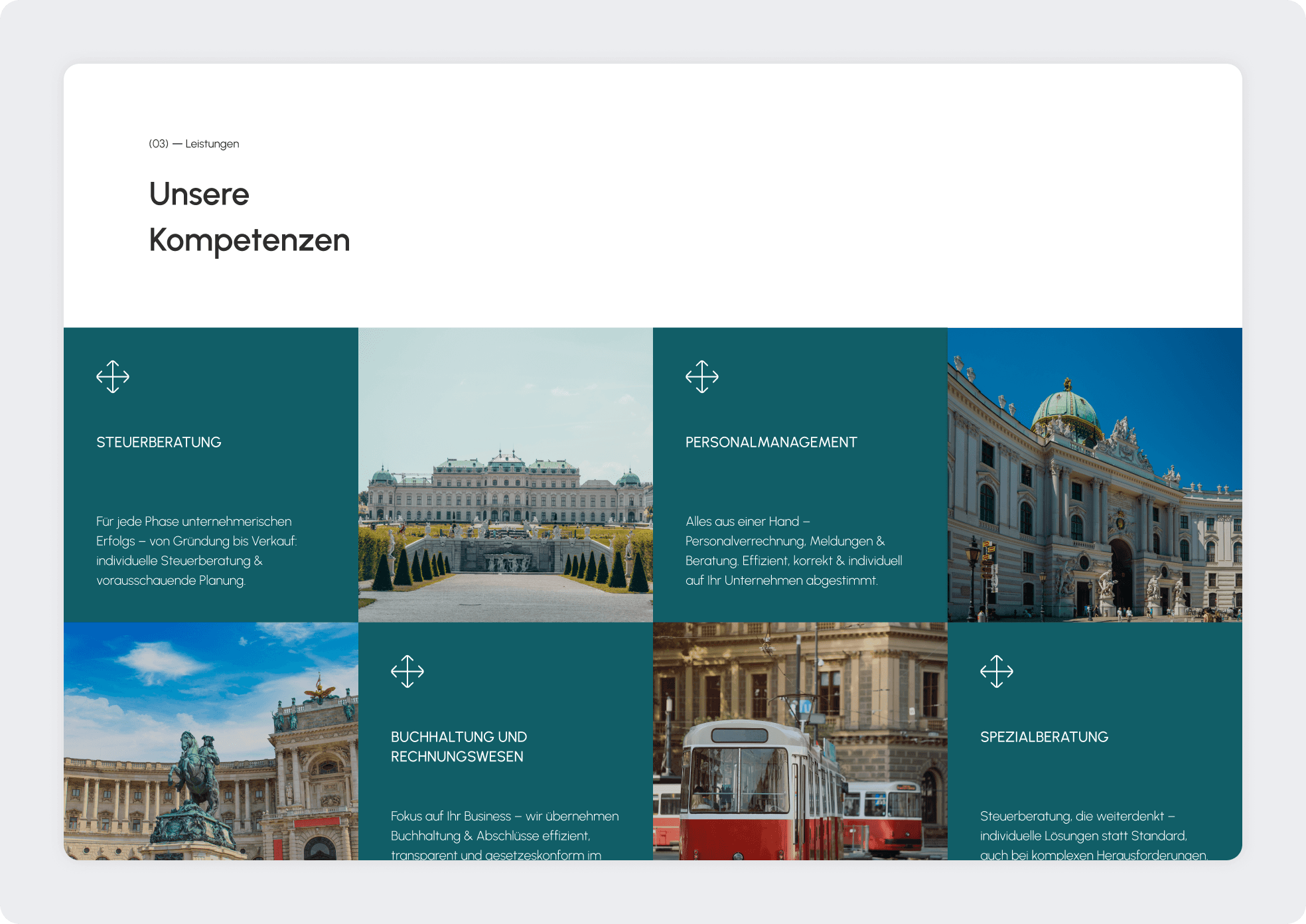
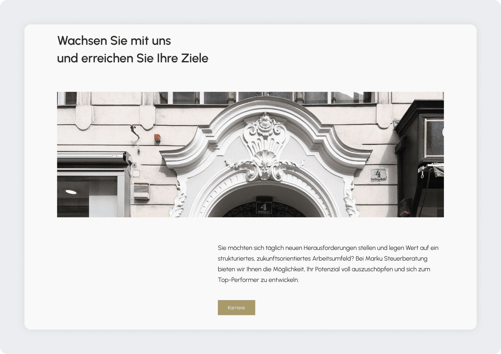
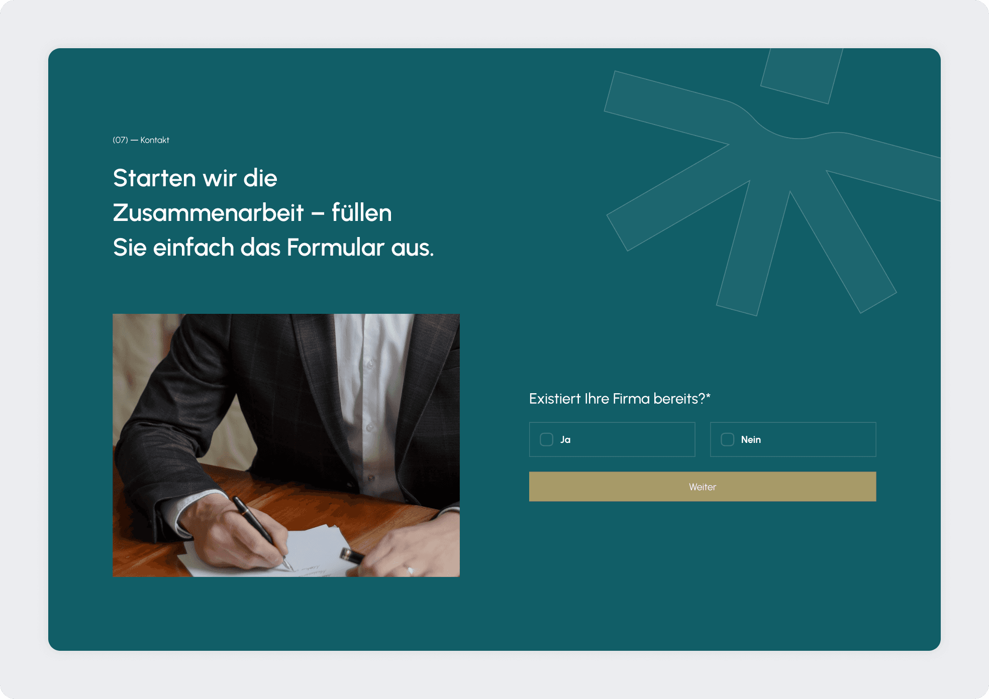
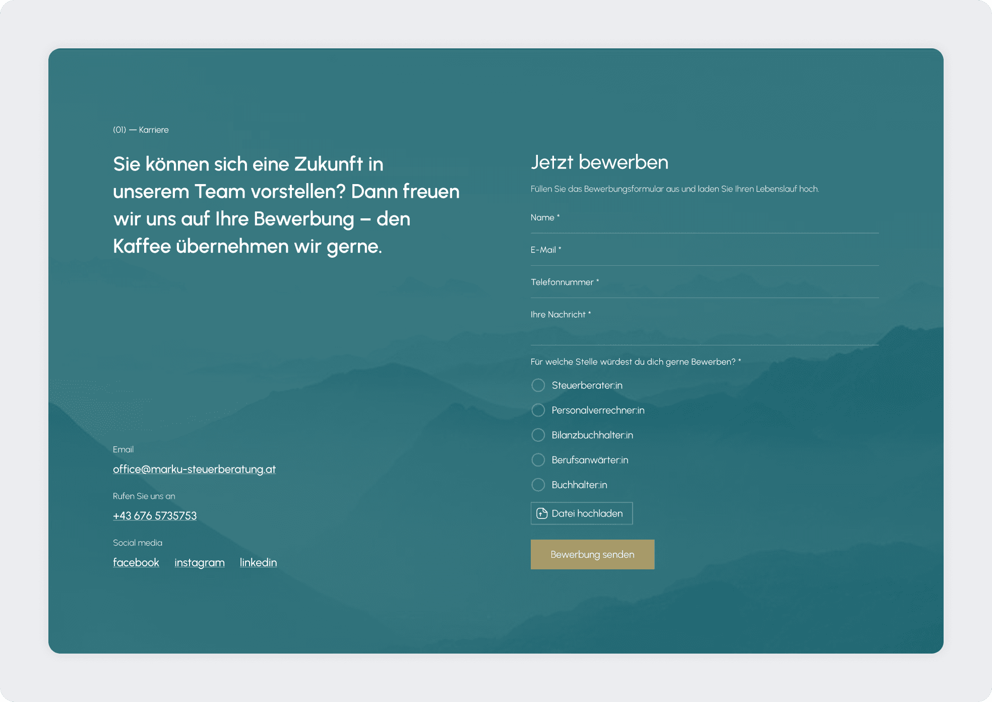
The primary challenge was presenting complex tax and financial services in a way that feels accessible and structured. Tax advisory websites often contain dense information, legal terminology, and multiple service categories, which can quickly become overwhelming for visitors. Another challenge was establishing trust through design. In financial services, credibility is essential. The interface needed to communicate professionalism, stability, and reliability while avoiding visual clutter or overly decorative elements. Service segmentation required careful structuring. Business clients and private individuals often seek different solutions, so the website needed a clear navigation logic that supports both audiences without creating confusion. Additionally, the previous structure lacked strong calls to action and did not guide users clearly toward consultation or contact. Improving conversion flow while maintaining a formal tone was an essential part of the redesign.
Challenges
The primary challenge was presenting complex tax and financial services in a way that feels accessible and structured. Tax advisory websites often contain dense information, legal terminology, and multiple service categories, which can quickly become overwhelming for visitors. Another challenge was establishing trust through design. In financial services, credibility is essential. The interface needed to communicate professionalism, stability, and reliability while avoiding visual clutter or overly decorative elements. Service segmentation required careful structuring. Business clients and private individuals often seek different solutions, so the website needed a clear navigation logic that supports both audiences without creating confusion. Additionally, the previous structure lacked strong calls to action and did not guide users clearly toward consultation or contact. Improving conversion flow while maintaining a formal tone was an essential part of the redesign.
The process
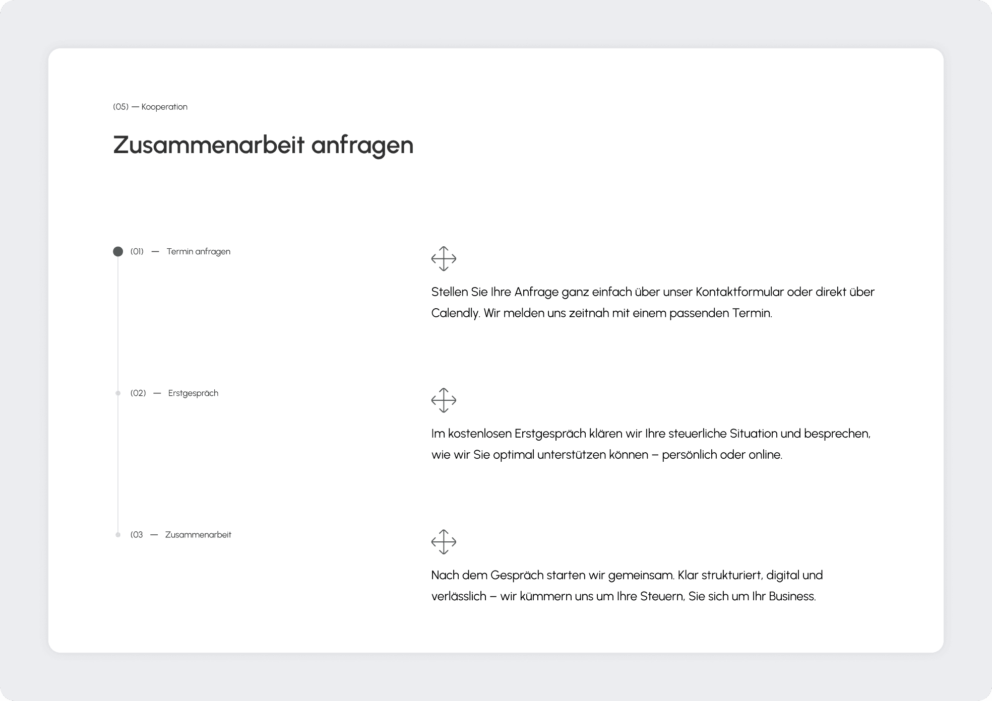
The process began with restructuring the information architecture to clearly separate service categories and define user journeys for different target groups. Wireframes focused on clarity, strong typographic hierarchy, and logical content segmentation. The visual direction emphasized professionalism through a restrained color palette, structured spacing, and refined typography. The layout was designed to communicate authority while remaining approachable. Clear call to action elements were strategically placed throughout the website to encourage consultation requests. Contact sections were simplified to reduce friction and improve conversion. Special attention was given to readability, ensuring financial topics are presented in digestible sections supported by clean layout rhythm and clear headings.
The process
The process began with restructuring the information architecture to clearly separate service categories and define user journeys for different target groups. Wireframes focused on clarity, strong typographic hierarchy, and logical content segmentation. The visual direction emphasized professionalism through a restrained color palette, structured spacing, and refined typography. The layout was designed to communicate authority while remaining approachable. Clear call to action elements were strategically placed throughout the website to encourage consultation requests. Contact sections were simplified to reduce friction and improve conversion. Special attention was given to readability, ensuring financial topics are presented in digestible sections supported by clean layout rhythm and clear headings.
The outcome
The final result is a structured and professional digital platform that strengthens brand credibility and improves client accessibility. Marku Steuerberatung now benefits from a modern online presence that clearly communicates expertise while guiding visitors toward consultation. The redesign enhances usability, reinforces trust, and establishes a scalable foundation for future content expansion and service growth.